UX/Product Design
ACC - Website Redesign

Table of contents
Overview
ACC hired me in November 2025 to optimize the homepage and pricing page of test subsite. Within a limited budget and without dedicated user research, I analyzed existing GA4 and Clarity data to identify and validate key UX issues.
The client’s main concern was stagnating membership numbers which were tracked back to internal (design and usability) and external (AIO and GEO visibility) issues. A review of the website, however, revealed additional, deeper heuristic and storytelling problems.
To increase conversion rates and strengthen ACC’s professional appearance, I audited the site and documented alternative design solutions. I conducted a usability test alongside a best practice analysis of the payment flow. Currently developing a StoryBrand questionnaire to help ACC differentiate itself from competitors in the Hungarian market.
The main pain points
- Information overload and large static elements creating a poor user experience
- Multiple user flow issues, with the most critical problems found in the cart and purchase flow
- Lack of coherent, user-focused storytelling
01. What we set out to solve & how
 Primary and secondary goals and how the project aims to accomplish them.
GOAL SETTING: Increasing conversion rate (especially the number of annual memberships) was set as the primary business goal. Secondary goals included strengthening the website’s professional appearance and reaching a wider audience.
AUDIT & DOCUMENTATION: To back up my findings, I first created a documentation with examples and studies supporting alternative design solutions, such as replacing the slider with a static hero section, and restructuring content hierarchy to highlight conversion-focused elements and to reduce the cognitive load.
TEST & RESEARCH: To validate my recommendations on creating a more user-friendly and conventional checkout experience, I conducted a usability test and a best practice analysis of similar international websites’ payment flow.
STORYBRAND: Finally, to ensure that ACC stands out from the competition on the Hungarian market – websites offering free ’tests’ based on subjective information – I am currently developing a questionnaire aimed at building a user-focused StoryBrand for ACC.
02. Key findings that shaped the design
- GA4 purchase journey data (Apr–May 2025) shows a 73.7% abandonment rate between view cart and checkout, suggesting significant friction in the cart experience.
- Clarity heatmaps revealed poor login state feedback and low slider engagement.
- Usability test findings in the checkout flow: anti-pattern effects, usability failures, confusing CTAs, and cognitive load from redundant content.
- Benchmark findings: more conventional purchase models observed on international peer sites; competitor’s SEO techniques that migth give them a ranking edge.


03. Restructuring the purchase flow
Pain points of the flow
- No “Buy” button above the fold on the test page
- First click redirects to the Pricing page instead of adding the product to cart
- The plan’s name and button label change unexpectedly, not following e-commerce conventions
- User must click “Buy” a second time to complete the action
- The cart appears on the Pricing page alongside membership plan CTAs, causing visual conflict
- Cart icon does not provide consistent feedback


A better experience for both users & the business
RECOMMENDED MODIFICATIONS:
- Empty cart state should display clear feedback on the cart page
- Prevent adding products the user already has access to via package or membership
- Limit coupon usage to one at a time
- Cart icon should consistently reflect cart contents across all pages and update immediately on add
- Show contextual pop-ups for edge cases, including when a membership would be more cost-effective than multiple individual test purchases

The iteration we landed on & its limits
The pre-redesign pricing flow – despite its UX issues – had proven effective at converting users to membership purchases. Stakeholders were concerned that changing how the pricing page works could disrupt this trend.
As a response to these concerns, we reached a compromise: a pricing overview section before the cart, that appears conditionally when an individual test or a package is added. This keeps some of the original conversion logic intact while improving the flow.
However, this is still a pushy solution as it prioritises conversion over user experience. Therefore I recommended developing a more coherent copy strategy, and working on a StoryBrand-based approach to reframe how pricing and the value proposition are communicated.
04. What ACC should say & to whom
To answer this question, we first need to ask more.
1. Why is choosing a single message hard?
ACC’s audience can be segmented in multiple ways, not only because the association operates across several activities, but also because even within product testing, users come with different motivations and needs.
Additionally, ACC needs to differentiate itself from free Hungarian competitors, while also wanting to communicate its values around environmental consciousness.
2. What does the term “conscious consumption” mean?
The product test page currently communicates several overlapping messages, with “conscious consumption” as a recurring theme. But what does this term actually mean?
For the association, it primarily stands for environmental values, while users often interpret it as financial. Stakeholder interviews confirmed this gap: the website reflects what matters to ACC, while users’ primary motivation is different.
The test was very thorough, the only thing I didn’t like was that it completely ignored price-value ratio…
↳ So it didn't deliver exactly what its name promises. Conscious consumption is precisely about taking price-value ratio into account.
– Reddit users, r/askhungary
3. How to stay faithful to the mission while meeting users where they are?
The goal is to define a single, focused message that addresses the main pain point of ACC’s largest user segment and use it as a sales funnel, motivating users to become members.
ACC’s mission and values can then be used to validate its authority in the testing field.
From there, creating BrandScripts for other user segments can spread messages more aligned with environmental consciousness, an important part of the association’s mission.
Not forcing this message, but letting it surface gradually, allowing it to soak into the user’s consciousness over time.
4. Building up the storybrand framework
ACC operates in a unique position in the Hungarian market, essentially selling a new product category. No other organization charges for product testing in Hungary, which means customers don’t yet know this service exists.
During our work, one stakeholder summed it up:
ACC is like a startup introducing something entirely new to the market. This makes a consciously built customer journey essential, one that first convinces users of the value of paid, lab-based testing, and then makes the case for why membership is worth more than a single purchase.
– ACC stakeholder
I found we need to funnel the communication in one direction, and the best way to do this is to build up an SB7 script.


What I’ve learnt
Working with ACC gave me the opportunity to narrow down my interests within UX. As my first solo project – and ACC being an NGO in Hungary, with all that this implies – I was hired in a unicorn role: asked to redesign the site for a more professional appearance, but through stakeholder interviews the real goal surfaced: increasing conversion.
This pushed me to think beyond design. After a stakeholder described ACC as a startup, I realized I needed to understand the business side better, which led me to Donald Miller’s StoryBrand framework.
The day you stop losing sleep about your own success and start losing sleep over your customers’ success is the day your business will start growing again.
— Donald Miller
The project also developed my communication skills: asking the right questions, understanding stakeholder needs, and reasoning through decisions clearly enough to convince them when I see a better solution.
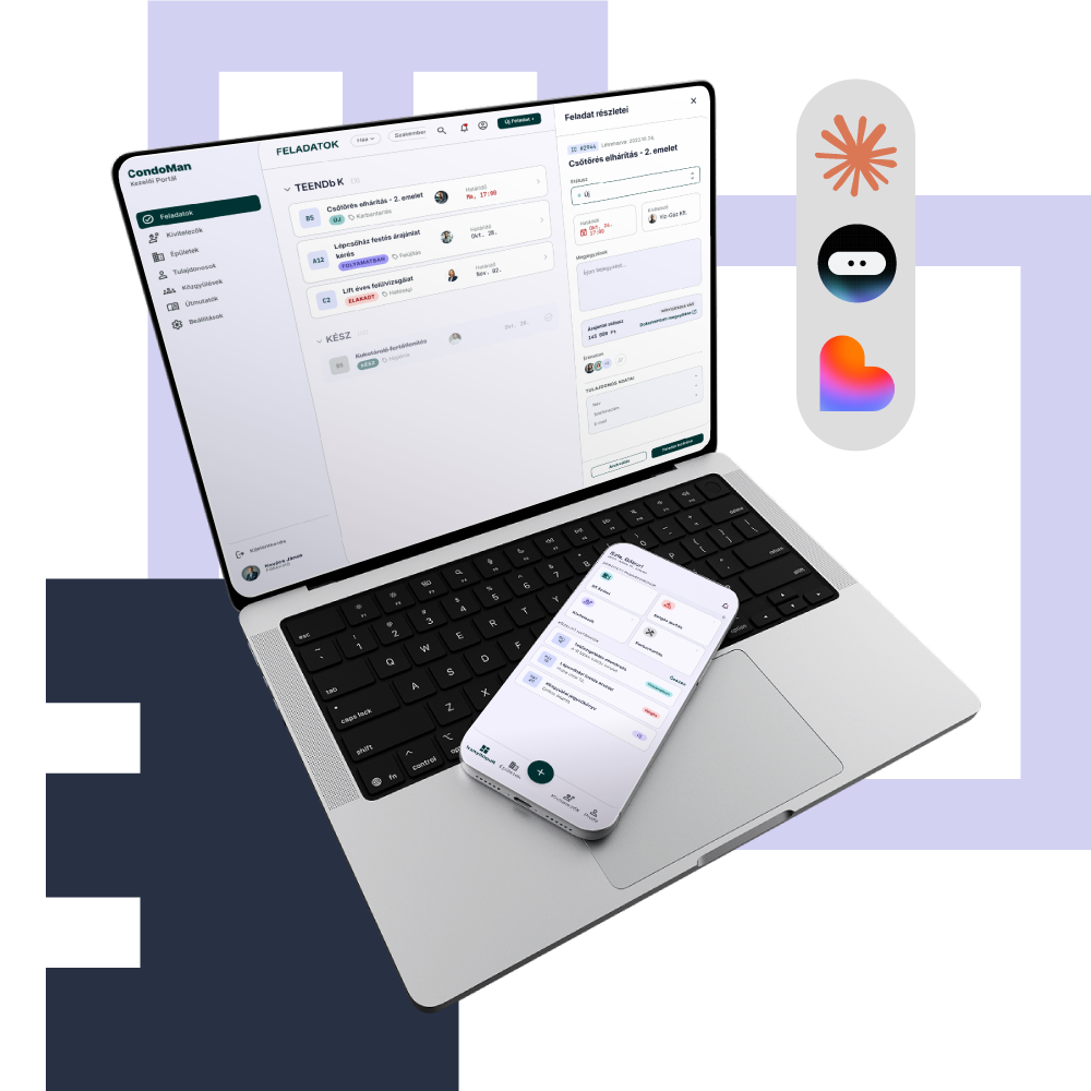
Condo Manager App – Vibe Coded MVP